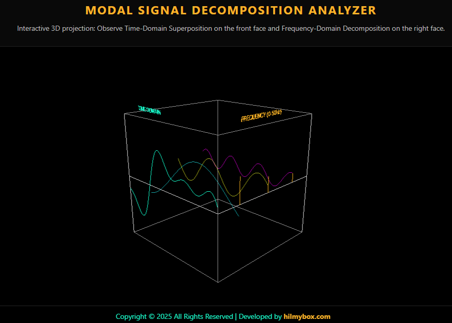
A browser-based diagnostic terminal for the question every vibration engineer asks: what frequencies are actually inside this measured signal?
In vibration engineering, you measure a structure's response — a beam wobbling under load, a turbine blade humming under rotation, a building shifting in the wind, a machine bearing fault you're trying to diagnose — and what you get back is a time-domain signal. A wavy line on a chart. From that line, you have to determine which natural frequencies the structure is exhibiting, whether any of them are dangerously close to operating frequencies, whether there's a resonance condition forming, whether a fault signature is hiding inside the noise.
The mathematical tool for this is the Fourier transform: it decomposes the messy time-domain signal into its constituent frequency components. The math is solved and standard. The intuition — what the transform actually does, why two completely different time signals can have the same frequency spectrum, how to read a spectrum confidently — is harder to come by.
This is the visualiser I built so the intuition arrives earlier.
Try it here — runs in any modern browser.
Who this is for
The audience is mechanical engineering students learning vibration analysis. Anyone studying machine condition monitoring or structural health monitoring — fields where you live or die by your ability to read a frequency spectrum. Acoustic engineers, dynamics analysts, modal testing practitioners, anyone whose work involves looking at a wavy line on an oscilloscope and understanding what it tells you about the structure that produced it.
How it works
You see a transparent 3D coordinate cube — a diagnostic terminal aesthetic, glowing neon edges against dark space. Three independent sinusoidal signals run inside the cube, each with its own amplitude and frequency sliders. Their sum runs alongside them — the kind of composite signal a vibration sensor would actually capture from a real structure with multiple modes active. At the right face of the cube, vertical bars rise to show the frequency-domain representation: a bar for each contributing component, height proportional to amplitude, position along the depth axis proportional to frequency.
Adjust any signal's amplitude or frequency. Watch the time-domain wave change shape on one face of the cube, and the corresponding frequency bar change height on the other face. The two views of the same data are visibly the same data, presented from two different angles.
This is the exact problem vibration analysts face every day, in miniature: you have a measured signal that's the sum of multiple structural modes, and you need to separate them into their components to identify what's resonating.
The core idea
The principle is that the Fourier transform isn't a mathematical trick — it's a change of viewpoint. The same vibration signal exists in both domains simultaneously. The time-domain view tells you what the sensor measured. The frequency-domain view tells you which structural modes contributed to it. Neither view is more fundamental; they're two coordinate systems on the same data, and a vibration engineer needs fluency in both.
Most curricula teach the two domains separately. You learn time-domain signals in one chapter, frequency-domain analysis in another, and the FFT appears as a sort of mathematical bridge between them. The tool puts them on the same screen, in literal physical relation to each other, so the change-of-viewpoint metaphor becomes intuitive rather than abstract. Time runs along one axis of the cube. Frequency along another. The same signal is what it is from both angles.
The visualisation is intentionally minimal. A wireframe cube. Glowing signal lines. Vertical frequency bars. No decoration that doesn't serve the metaphor. The diagnostic-terminal aesthetic reflects what the math is for — diagnosing which structural modes are present in a measured response.
The moment the spectrum becomes obvious
The reason for building this is a moment that happens once a student has played with the sliders for a few minutes. They start with one signal — a clean sinusoid, one peak in the spectrum. They add a second signal at a different frequency — the time-domain wave gets messier, but a second peak appears in the spectrum, cleanly separated. They keep adding signals. The time-domain trace becomes nearly unreadable. The spectrum stays clean: each contributing mode is still visible as a separate bar.
That's the moment vibration engineers internalise spectrum analysis. Real-world vibration measurements are almost always messy in time — every machine you'd measure has multiple modes responding simultaneously, plus background noise, plus operational disturbances. The spectrum is where they separate. After watching this happen twenty times in the simulator, the student stops asking "what does the FFT do?" and starts asking "why was I trying to read the raw time signal in the first place?"
What this is
A real-time visualisation of vibration signal superposition and decomposition, in a single 3D scene where both views are visible simultaneously. Built so the frequency-domain view of a vibration signal stops being a separate subject and starts being the same data from a different angle — which is what it is.
Coming next
A tutorial article and YouTube video are in production: how this tool was built with AI coding agents, including the signal summation engine and the dual-domain visualisation. Subscribe for when it ships.