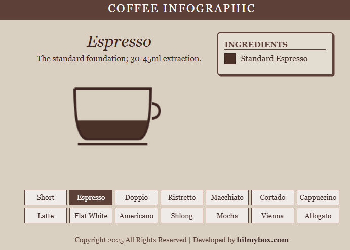
A compact interactive infographic for the fourteen most common espresso-based drinks — for the moments you can't remember whether a flat white has more milk than a latte.
This one wasn't engineering. It came out of an entirely different need: I kept forgetting the exact ratios of the various espresso drinks. Macchiato, cortado, flat white, latte, cappuccino — they all start with espresso, all add some amount of milk, and the differences between them are surprisingly hard to remember.
A compact infographic seemed like the right answer. Pick a drink, see the layers, see the ratios. One tab, no scrolling. Click here to access.
What it is
An interactive coffee infographic. Click a drink name from the menu, and the cup on screen visually fills with the correct layers — espresso at the bottom, milk in the middle, foam on top — in the proportions specific to that drink. A smooth liquid-filling animation interpolates between drinks as you switch.
The data is small and authoritative — fourteen drinks, each with a defined recipe — and the visualisation is intentionally clean. No advertising, no recipe blog filler, no scroll-through introduction. Just the cup and the ratios.
What stayed with me
A reminder that good information design beats good content design in a lot of contexts. Most online coffee guides are articles — long, prose-heavy, padded with anecdotes about origins and roasting. Almost nobody needs that when they're trying to remember the difference between a macchiato and a cortado. They need the picture.
This was also where I confirmed the value of interpolated transitions. The cup doesn't just snap from one drink to another — the liquid layers animate from old proportions to new proportions over half a second. That smooth interpolation makes the comparison instantly readable, in a way a static diagram never quite manages.
Part of the journey — a reminder that not every project needs to be about engineering.