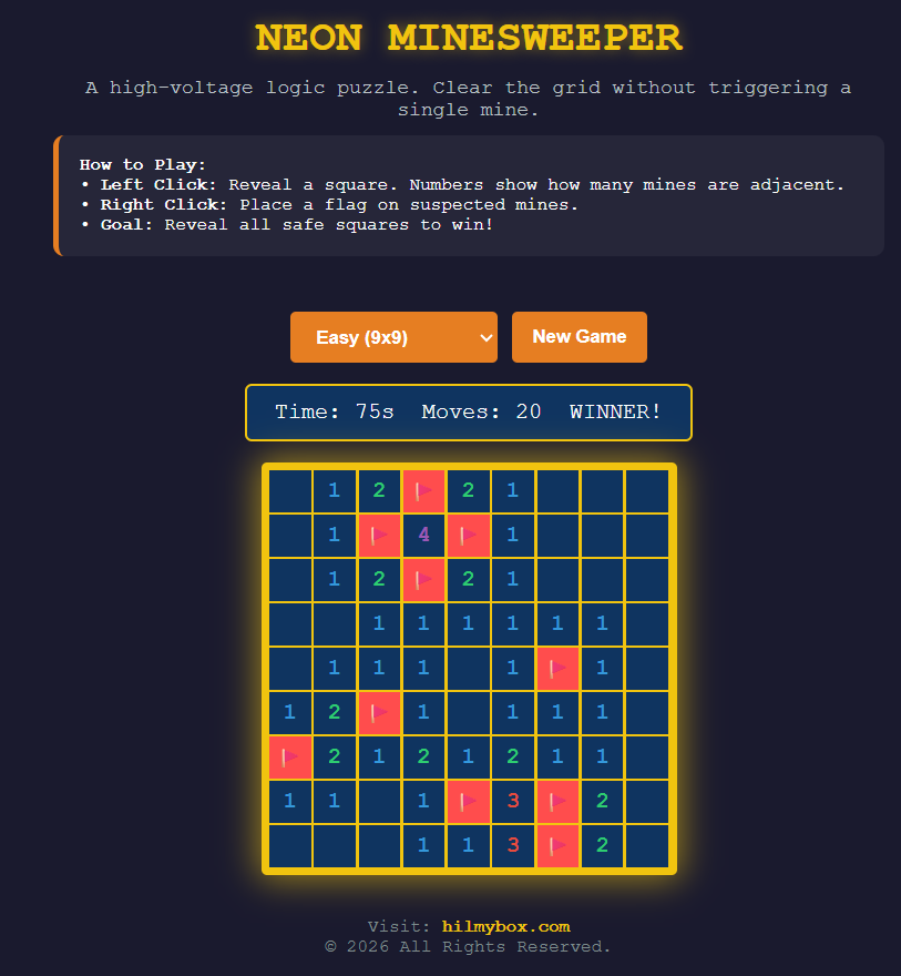
The Windows 95 staple, rebuilt in a glowing aesthetic for the browser, with mobile support that actually works.
Some games don't need to be redesigned. They need to be re-presented.
Minesweeper is one of those games. The logic is perfect — flood-fill reveals, neighbour-count clues, flagging, the slow contraction of safe space as the player works inward. Forty years after it shipped with Windows, the rules haven't aged a day. What has aged is the original interface: chunky 16-bit icons, beveled gray buttons, the same flat grid that has greeted bored office workers since 1990.
Neon Minesweeper is the same game, in the aesthetic it should have always had.
Play it here — runs in any modern browser, with proper mobile support for flagging via long-press.
Who this is for
The audience is anyone who likes Minesweeper but hasn't played it in a while. Anyone who wants a quick logic puzzle on their phone without the ad-laden free-game ecosystem. Anyone who appreciates classic game design wrapped in modern presentation. Or anyone with five minutes to fill on a tablet.
How the game works
The rules are unchanged from the original. A grid of cells, some containing mines. Click a cell to reveal what's under it. If it's a mine, you lose. If it's a number, that number tells you how many mines are in the eight neighbouring cells. If it's empty (zero neighbouring mines), the game automatically reveals all adjacent cells, cascading outward until it hits numbered boundaries. Right-click (or long-press on mobile) to place a flag where you suspect a mine.
Win condition: reveal every cell that doesn't contain a mine. Three difficulty levels scale the grid size and mine density.
The core idea
The principle is that good visual design can refresh an interaction without changing it. The cells in Neon Minesweeper glow when revealed. Flags pulse softly. Mines, when they explode, light up the surrounding cells in a brief flash. The aesthetic is consistent — neon glow on dark backgrounds, custom colour variables that maintain the look across every element. The visual language is "cyberpunk command terminal," and it serves the same role the original's beige-grey served in 1990: framing the game as a serious activity, even though it's a five-minute logic puzzle.
The mobile support gets actual attention. Long-press to flag, with proper handling of the touchstart/touchend timing so a quick tap doesn't accidentally place a flag. Pan-and-zoom on larger grids so the hard difficulty stays playable on a phone screen. A stats bar tracks moves and elapsed time, sized for thumbs.
The moment the visual frame matters
The reason for building this is a small theory about classical games. They're called classical because their rules are timeless, not because their interfaces are. Chess survived the transition from physical boards to digital screens by being re-rendered for every era. Solitaire survived the transition from a card deck to Windows by being re-skinned every decade. Minesweeper deserves the same treatment, and the original interface — preserved virtually unchanged for thirty years — has earned its retirement.
Neon Minesweeper is what the same game looks like in 2026 instead of 1990. The logic is identical. The atmosphere is different. The player engages with the same puzzle, but the puzzle now sits in a frame that reads as contemporary.
What this is
The original Minesweeper, in the visual language of contemporary game design. Free, no account, no ads. The classic puzzle with a frame that's worth opening.
Coming next
A tutorial article and YouTube video are in production: how this version was built with AI coding agents, including the flood-fill algorithm, the long-press mobile handling, and the CSS variable theme system. Subscribe for when it ships.