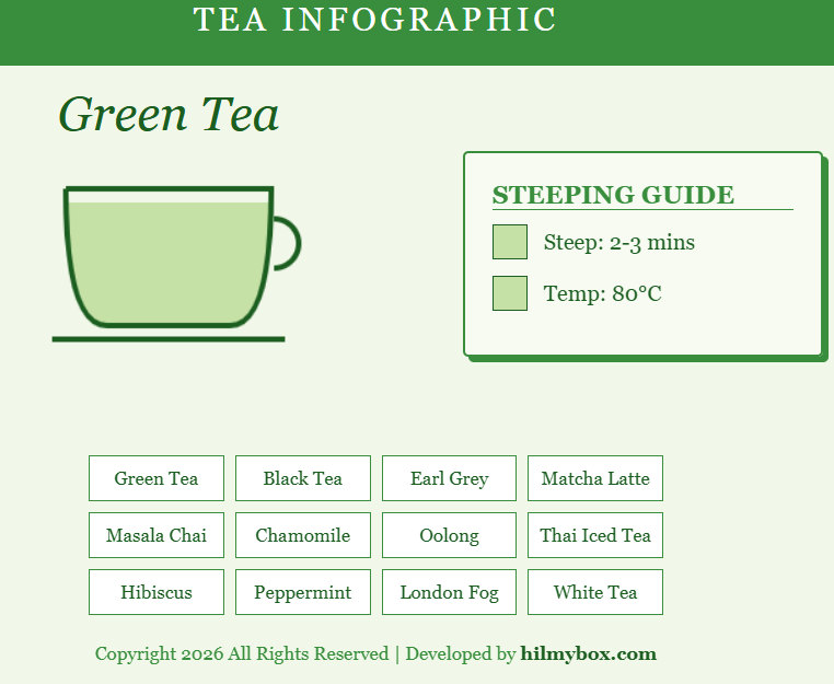
A companion to the coffee infographic — for the moments you need to remember whether green tea wants 70°C or 80°C water.
After the coffee recipe infographic, the tea version was almost obvious. Tea is even more parameter-dependent than coffee — temperature, steep time, leaf ratio — and the parameters vary significantly between green, oolong, black, white, and herbal teas. The same compact-infographic format that worked for coffee adapted naturally. Access it here.
What it is
An interactive guide to tea preparation. Pick a tea type. The cup on screen fills with the correct colour profile, and the recommended water temperature and steep time appear alongside it. Switch types and the cup smoothly transitions to the new specifications.
The visual treatment is canvas-based rather than 3D — the cup is "painted" frame-by-frame as the values change, using a smooth tween between states.
What stayed with me
The pattern that infographic-style tools work best when the data is small and authoritative. Fourteen coffee drinks, six common teas — these are small datasets with definitive answers. There's no "well, it depends on your taste" hedge needed for the basic ratios. The tools just give you the picture.
The other observation was that 2D canvas rendering still has its place. Many projects benefit from 3D, but for something this contained and informational, plain 2D canvas with smooth interpolation does the job better than 3D would. A reminder that "everything in 3D" isn't always the right answer.
Part of the journey — another non-engineering piece, and a reminder that small focused tools can be more useful than they look.