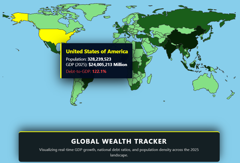
A spatial analysis of 2025 macroeconomic indicators — built to see what global GDP data looks like in 3D.
This was a companion piece to the US Population Map. Same general idea — geographic data lifted into 3D — but at a global rather than national scale, with economic indicators instead of demographic ones.
Countries become 3D meshes, with metadata attached for raw GDP, debt-to-equity ratios, and demographic shifts. Hover over any country to see the data. The visualisation uses an orthographic projection rather than a perspective camera, which keeps the country shapes undistorted regardless of where they sit on screen. You can access it here.
What it is
A global interactive economic map. Each country is an extruded mesh with its 2025 economic indicators stored as metadata. A cursor-driven ray-cast detects which country you're hovering over and surfaces the data. Colour interpolation indicates the magnitude of whatever indicator is currently being displayed.
The orthographic projection is the key visual decision — perspective cameras distort country sizes near the edges of the view, which would be misleading for comparison purposes.
What stayed with me
The technical lesson was the value of orthographic projection for comparative data visualisation. A choropleth map renders fairly with perspective, but the moment you start comparing relative sizes — is country A's GDP bar taller than country B's? — perspective distorts the answer. Orthographic preserves the proportions. The choice of camera projection is, in this context, a piece of data integrity.
The broader observation was that economic data is hard to visualise honestly. A single number (GDP) hides enormous variation (per capita, growth rate, debt). A single colour map can mislead. The Sentinel surfaced the underlying complexity rather than reducing it to one metric — which made the visualisation more honest, even at the cost of being less immediately legible.
Part of the early experiments — testing data visualisation patterns at global scale.